Visitor Station
An adventure VN inspired by the original Resident Evil game and the movie The Thing.
| Status | Released |
| Platforms | HTML5 |
| Rating | Rated 5.0 out of 5 stars (3 total ratings) |
| Author | Ester Olsen |
| Genre | Visual Novel, Interactive Fiction |
| Made with | Godot |
| Tags | Horror, Lesbian, LGBT, suspense, Thriller, Yuri |
| Average session | About a half-hour |
| Languages | English |
| Inputs | Mouse |


Comments
Log in with itch.io to leave a comment.
game doesn't work, missing file error!?
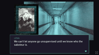
Love me a good mystery! The images used for the backgrounds are particularly good.
You managed to give your VN a more interactive feel than most, I really enjoyed that. Wandering around Visitor Station and unravelling the mystery was very captivating. Got a bit confused by some of the flashbacks, but that may have been the whole point. The ending seemed a bit rushed and didn't sit well with me. I felt like the actions should have had a bigger impact on the protagonists. But maybe we just don't know the whole story and it makes more sense than it lets on.
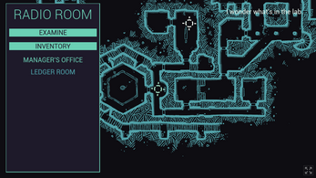
Navigation was fine. It took me a moment to find my way around the map, but I like it. The graphics (and colours) add a lot to the atmosphere. The story is also well written. Very intriguing.
This is a great, short VN. :)
Well that was lovely!
The story was engaging and I really liked the streamlined interface.
It did get confusing sometimes how to get to a place again, and it took a bit before I realized I was Erika, but I am nitpicking.
Great stuff!
"...with the tiniest of steps like we're penguins." I loved this line! The ending definitely surprised me. I think you did a great job of putting your own spin on the Resident Evil / The Thing inspiration. There were many well written parts and I wanted more by the end. I think that's a really good thing! Clara rocks, even if a little scary!
As someone who's interested in Interactive Fiction, I also liked how you stuck to the major points and didn't make any dialogue or description too long. It felt comfortable to play and more like watching a movie.
As for feedback, I only had trouble with one thing which was making sense of the navigation mechanic. It took me a few minutes to understand where I was going. After I started looking at the map, I realized my options were related to where I was. I know it must seem obvious to the developer but I really was lost!
Maybe highlighting the entire section we're currently on with a different color would help instead of the flashing icon. Also, giving a slightly different tint to the protagonist's portrait could emphasize we're Erika??
Your neocities mentions you're Korean! I'm playing this from Seoul!
Also, I'm working on Interactive Fiction content myself, if you're interested, I could keep you in the loop once I'm further along. Great game! :)